Electrolux伊莱克斯
- 项目类型:品牌服务+展示空间
- 项目面积:280m²
- 完成时间:2019年2月
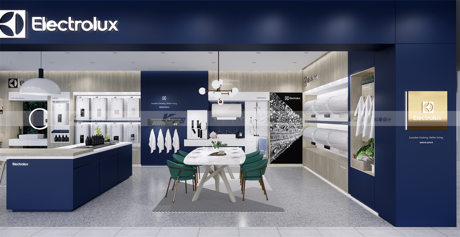
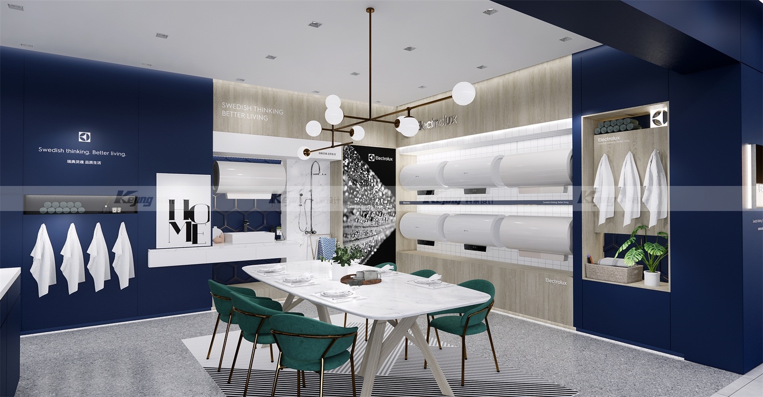
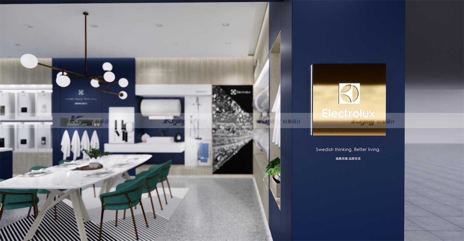
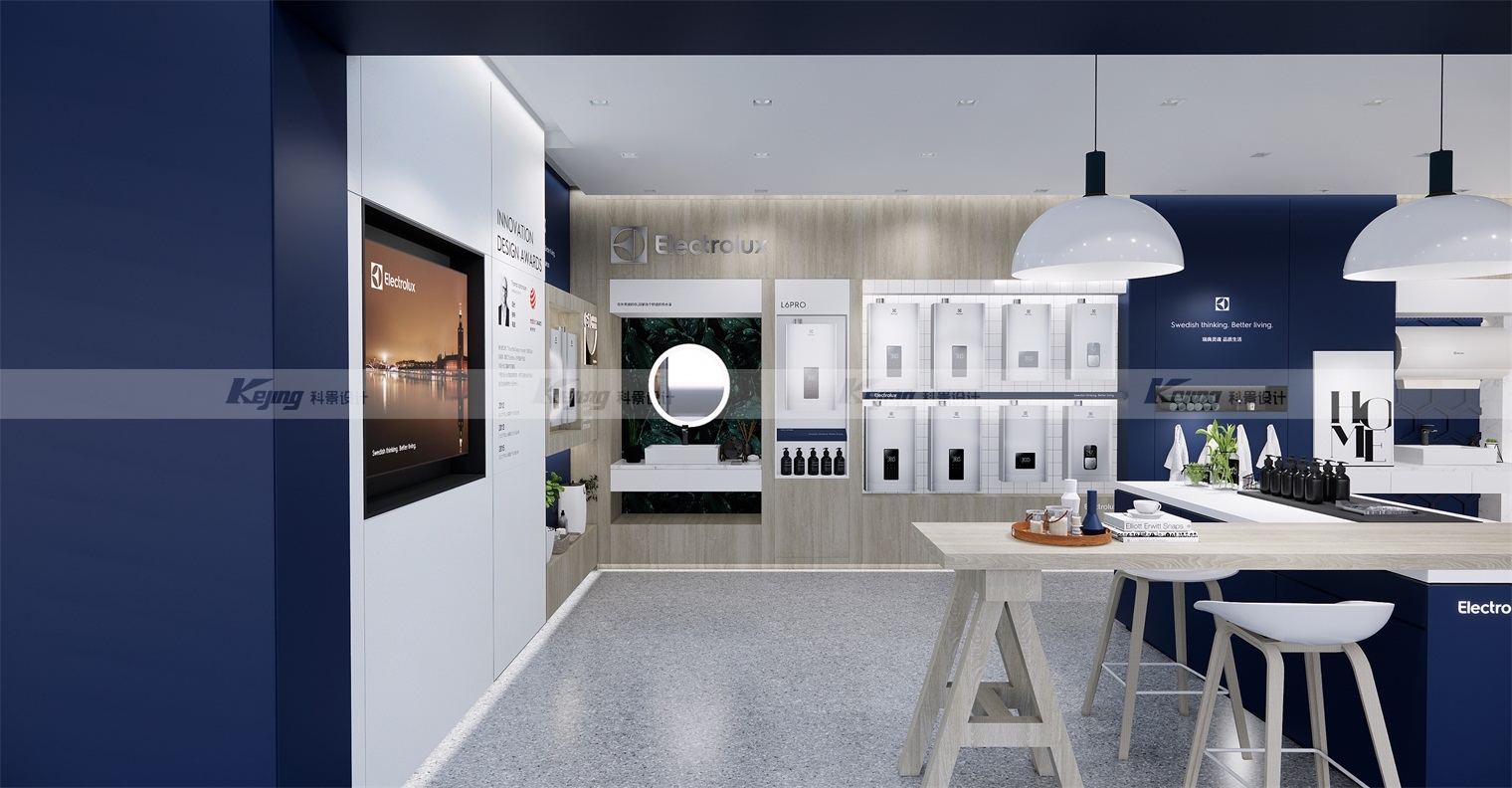
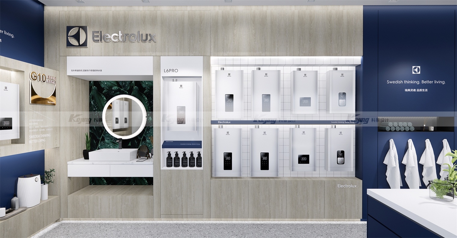
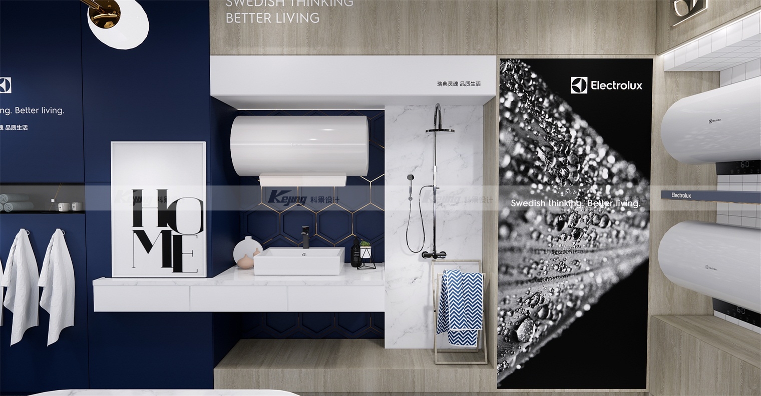
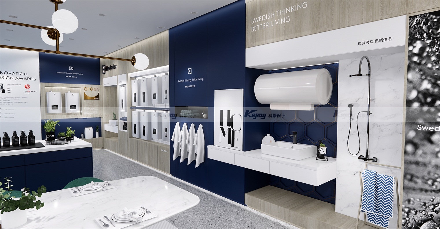
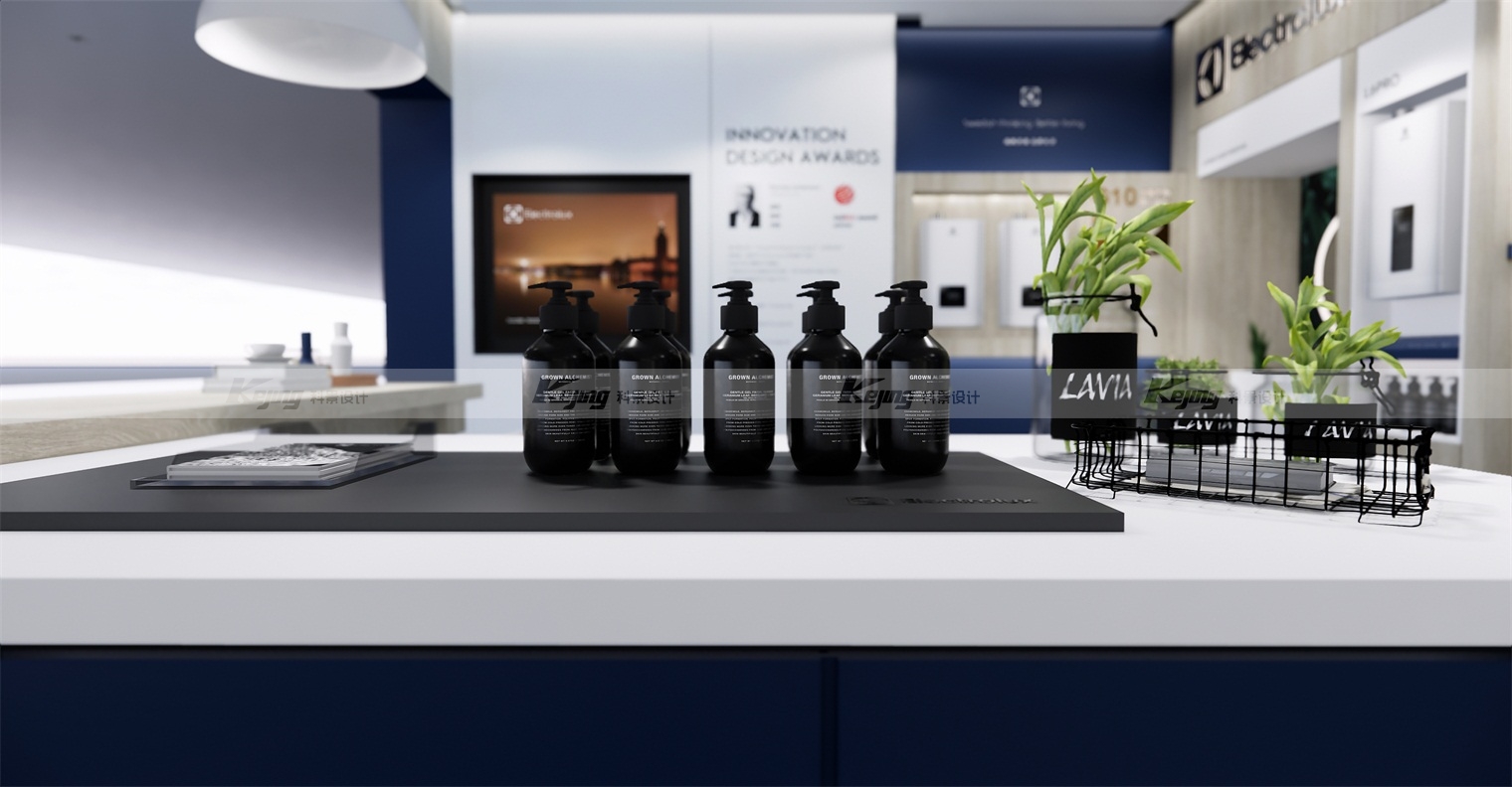
随着国内家电市场竞争格局的快速变化,伊莱克斯在运营中所表现出的:一线市场应变能力不足,造成市场活力下降等问题,逐步与伊莱克斯作为一个国际化品牌的战略目标、品牌价值相违背。我们建议回归零售本质解决品牌困局。通过“流量截流,提升客单值,增加动销概率,维护老客户”四个支撑点进行对品牌的有效拉升。结合品牌浓厚的北欧文化和品牌自身独特的设计风格,深化国际化形象,展现产品DNA。从用户角度出发,提升用户价值。我们根据瑞典品牌独具的北欧风情,我们为伊莱克斯建立了独特的颜色识别体系,整体设计大面积采用蓝色,以此深化品牌色彩调性,又与白色和原木色达到衬托互补的视觉效果,体现品牌“瑞典灵感,品质生活”的核心理念。伊莱克斯独特的设计风格,让每一件产品都似艺术品一般,简约而不简单,终端产品的陈列与品牌发源地的风格两相融合,将北欧风情演绎得淋漓尽致。
With the rapid change of competition pattern in the domestic home appliance market, Electrolux has shown in its operation that the first-line market has insufficient response ability, resulting in the decline of market vitality and other problems, which are gradually contrary to the strategic goal and brand value of Electrolux as an international brand. We suggest returning to the retail nature to solve the brand dilemma. Through the four support points of "stop the flow, improve the single value of customers, increase the probability of moving pin, and maintain the old customers", the brand can be effectively promoted. Combined with the strong Nordic culture of the brand and the unique design style of the brand, deepen the international image and show the PRODUCT DNA. From the perspective of users, enhance user value. According to the unique Nordic style of the Swedish brand, we have established a unique color identification system for Electrolux. The overall design adopts a large area of blue to deepen the tonality of the brand colors, and achieve complementary visual effects with white and wood colors, reflecting the brand's core concept of "Swedish inspiration, quality life". Electrolux's unique design style makes each product look like a work of art, simple but not simple. The display of terminal products is integrated with the style of the origin of the brand, and the Nordic amorous feelings are fully interpreted.
